Company:
Affiniti
Year:
2025
Overview
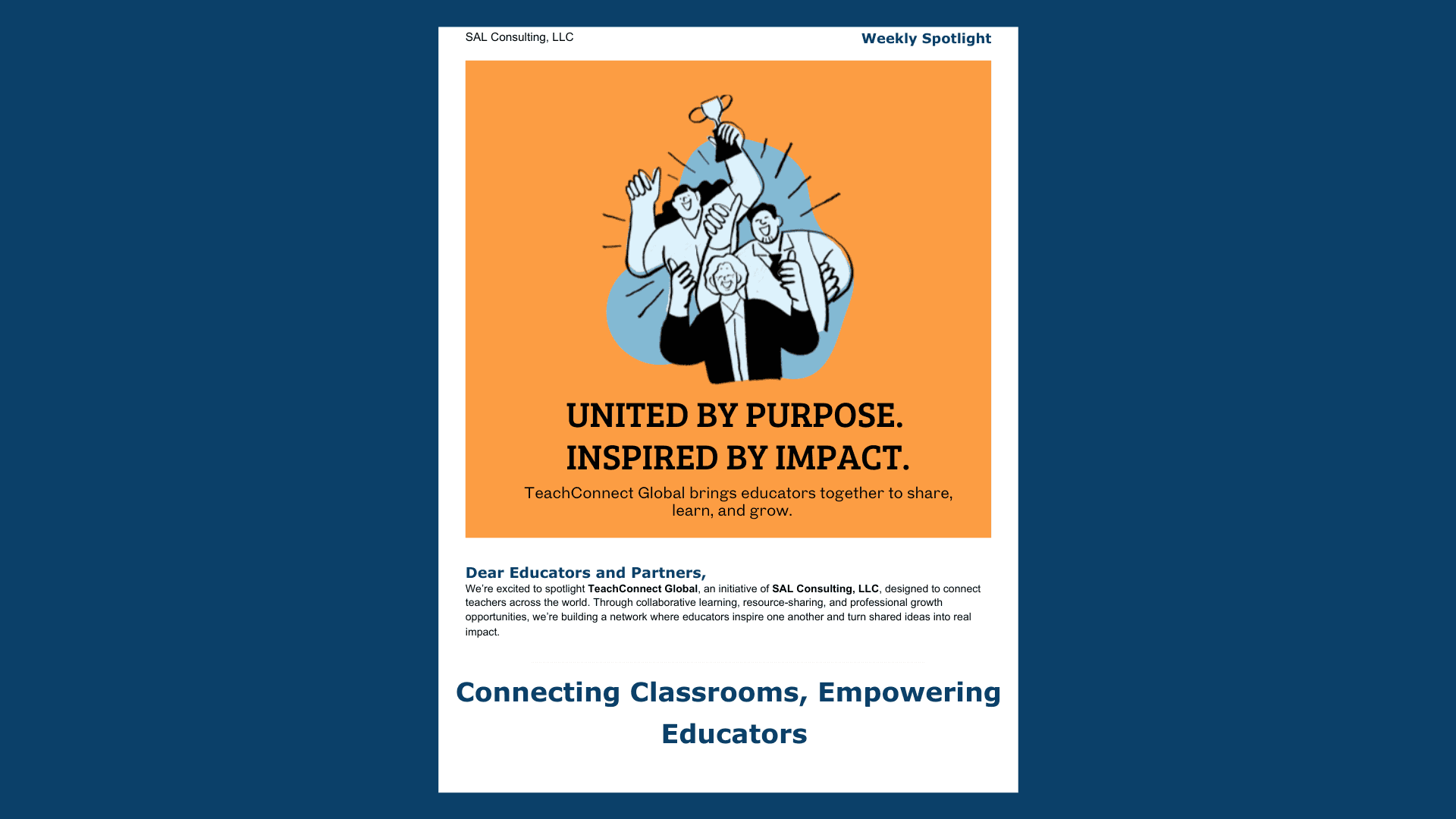
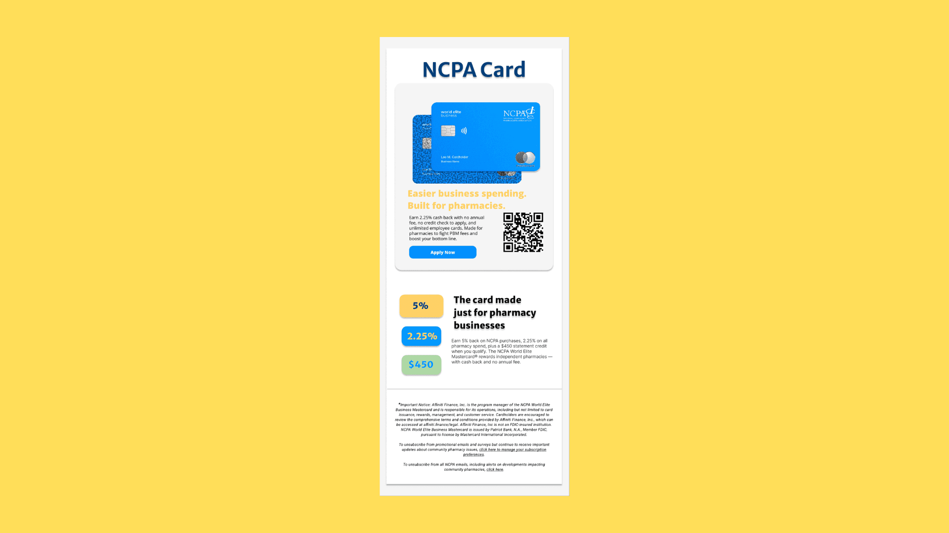
As part of my UX and digital communication case studies, I designed two email campaigns for AffiniPay’s NCPA Business Mastercard, aimed at independent pharmacy owners. The goal was to increase engagement and drive applications by simplifying the message architecture, clarifying benefits, and creating a visual rhythm that balanced accessibility and brand trust.
Both campaigns focused on business clarity through design — distilling financial information into visual cues and actionable takeaways. From color hierarchy to microcopy, every element was built to guide users seamlessly from awareness to conversion.
Design Goals & Strategy
The challenge was to communicate a complex financial product to a specific audience — small pharmacy business owners — in a way that felt credible, easy to read, and visually distinct from generic finance campaigns.
I used a structured grid system, warm color contrasts (blue and yellow), and clear value breakdowns (cash-back percentages, benefits, and security assurances) to guide attention through the email’s flow.
Typography and spacing were carefully optimized for mobile readability, since most target users accessed the content via smartphone. Each CTA (“Apply Now”) was tested for clarity, placement, and hierarchy to encourage higher click-through rates.
Outcome & Reflection
The final campaign templates achieved the balance between conversion-driven UX and brand alignment — integrating NCPA’s professional tone with an approachable, human-centered design.
This project strengthened my understanding of email UX, visual communication for fintech, and how subtle adjustments in hierarchy and messaging can significantly affect user engagement. It also reinforced the importance of clarity, empathy, and design accessibility when communicating financial tools to small business owners.